Problem
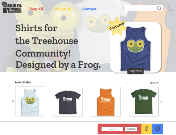
The current Shirts By Mike website is dated. Their branding needs refreshing and the content looks stale. They want a new site that’s fresh with various added campaigns. They also want to be able to highlight a featured t-shirt.
Audience
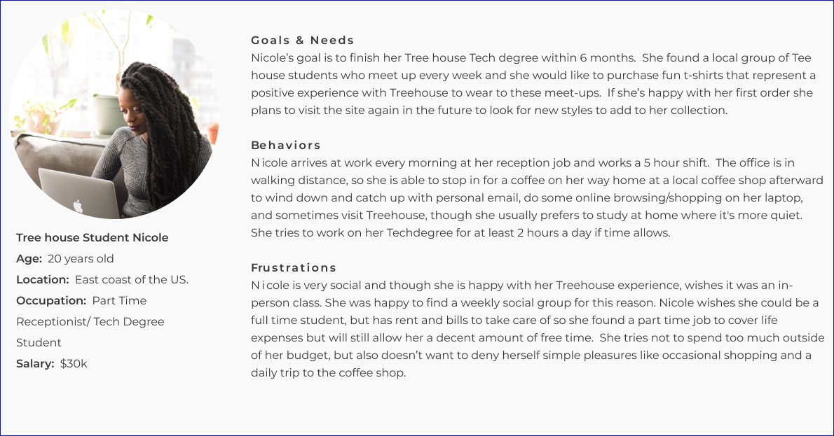
The target audience for Shirts By Mike would be current and former Tree house students, aged 16-35, and primarily based in the United States. Our audience is lifelong learners who value being a part of a community. I created a User Persona named Nicole, a 20 year old currently working as a part-time receptionist while she works on her Techdegree at Treehouse.
User Persona
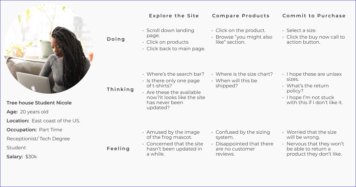
Journey Map
Solution
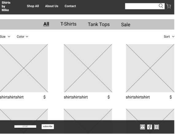
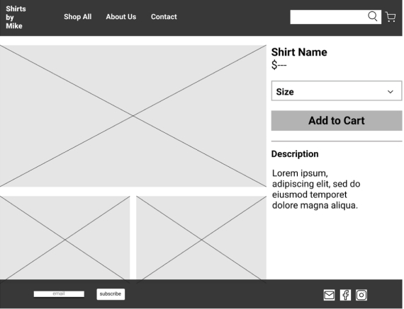
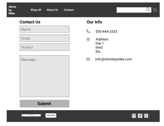
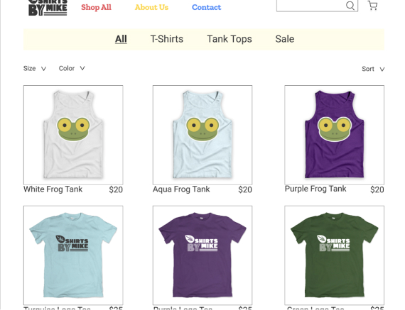
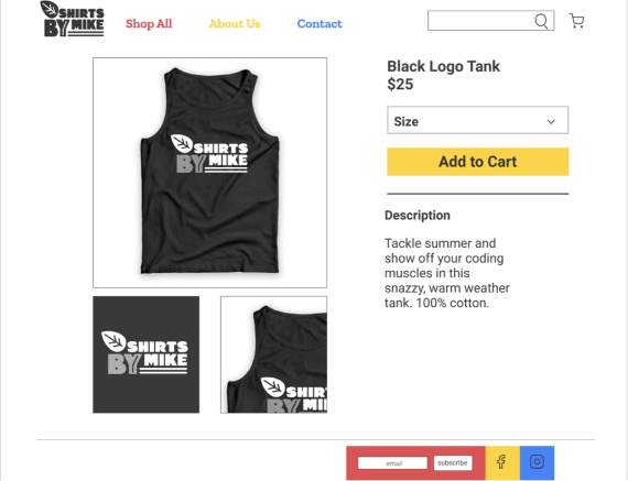
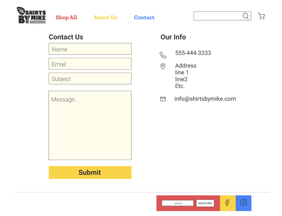
My redesign is rooted first and foremost in establishing a stronger trust relationship with the user. A site that looks like it hasn’t been maintained in 10+ years doesn’t convey accountability; how can the user be confident that they will ever even receive their order if the site looks abandoned? So to start there needed to be some basic features that are unconscious standards to online shoppers. More white space, photo carousels, intuitive header and footer actions, a clear way to contact the company all while maintaining the simplicity, and clues that a real community exists around the product. As for aesthetics, it was important to keep the feel casual, fun, and gender neutral. Keeping features modern but simple; making the layout intuitive and easy for anyone to navigate. Keeping colors bright but not skewed in an antiquated masculine or feminine way.
Brand Personality
A t-shirt is the epitome of casual clothing, so I made sure that the site appropriately reflects the product. This is a product that’s designed for a very specific community so warm and friendly, but also exclusive, fits the brand. It’s not marketed toward the random shopper looking for t-shirts, but for a niche group of students/lifetime learners who want to represent their educational platform. Niche community means exclusivity; niche community also means warm and friendly so the voice and copy need to read that way. This particular community has a quirky and fun vibe, so the approach is such; the mascot, greetings, and product descriptions all represent an exclusive community in a fun and friendly way. Users will connect with this experience as one that they recognize and have clicked with from Treehouse. The learning platform is fun, friendly and quirky in its lessons, the bridge to the ShirtsByMike products will mirror that experience and users will feel like they are in the right place to buy their representational clothing. This feeling that the user has “come to the right place” will set up a user's confidence to purchase the product.
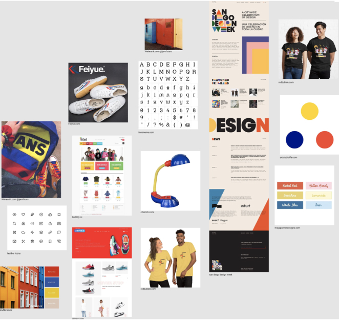

Since the majority of users are students, I put together a new color palette with a positive “back to school” feel. The site remains mostly white, very dark gray and neutral so that the use of color stands out in the header, footer, and certain call to action buttons.
Sketches
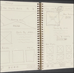
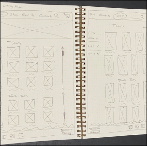
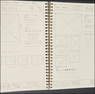
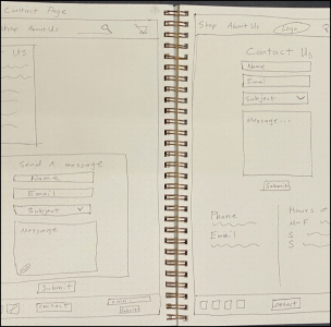
Wireframes
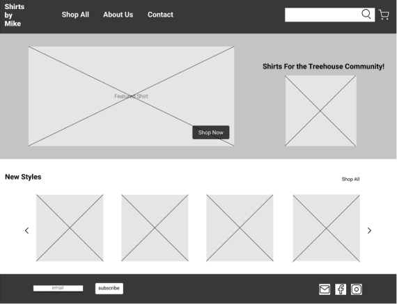
Hi-fi Mockups
Learnings
I learned that your initial plan can change many times before your project feels finished. Change in big ways and small ways, that the project can look the way you intended but not feel the way you intended and require little tweaks in color, font, layout, to get to the place that feels correct. I learned that there is not necessarily an A-Z path that gets you to the end result that you see in your head.
I would work in the opposite direction than I did with this project. For this website project I added everything I thought I wanted then slowly subtracted elements that I decided were cluttering the aesthetic and useability. In the future I think that I can streamline my process by trying to keep things as visually simplistic as possible (while still having all necessary elements) and add more if I think it will create a more successful user experience.
